Katy Sloane | REBRAND
Branding, Photoshoot & Squarespace Website Design
The Rebrand
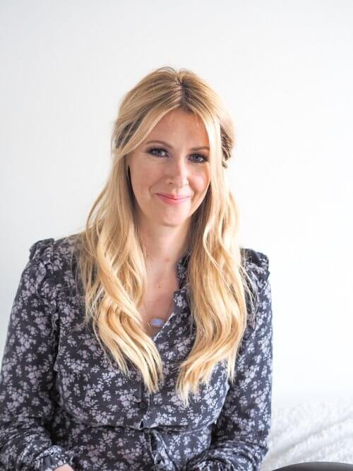
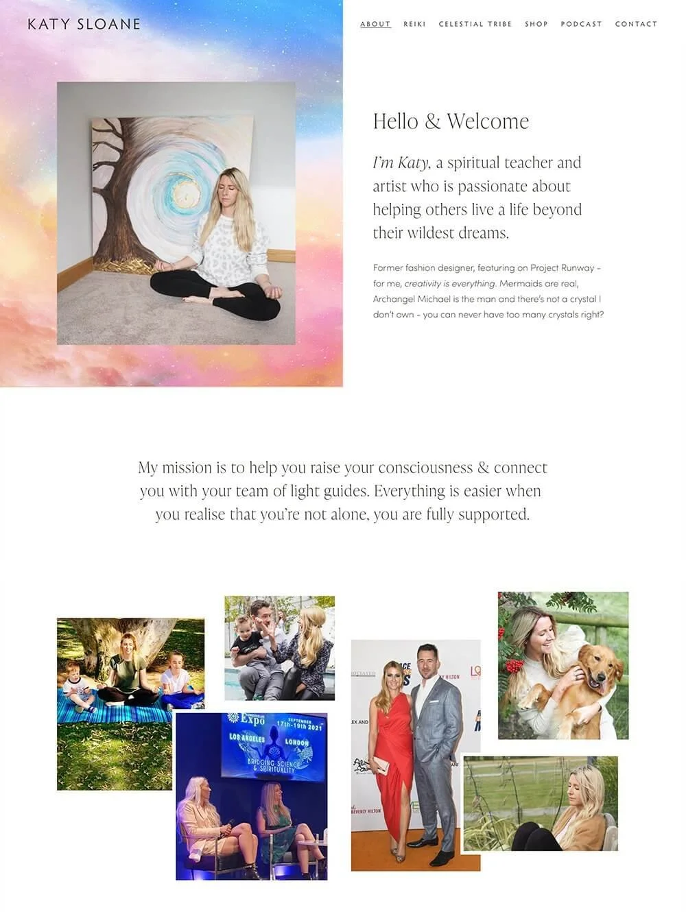
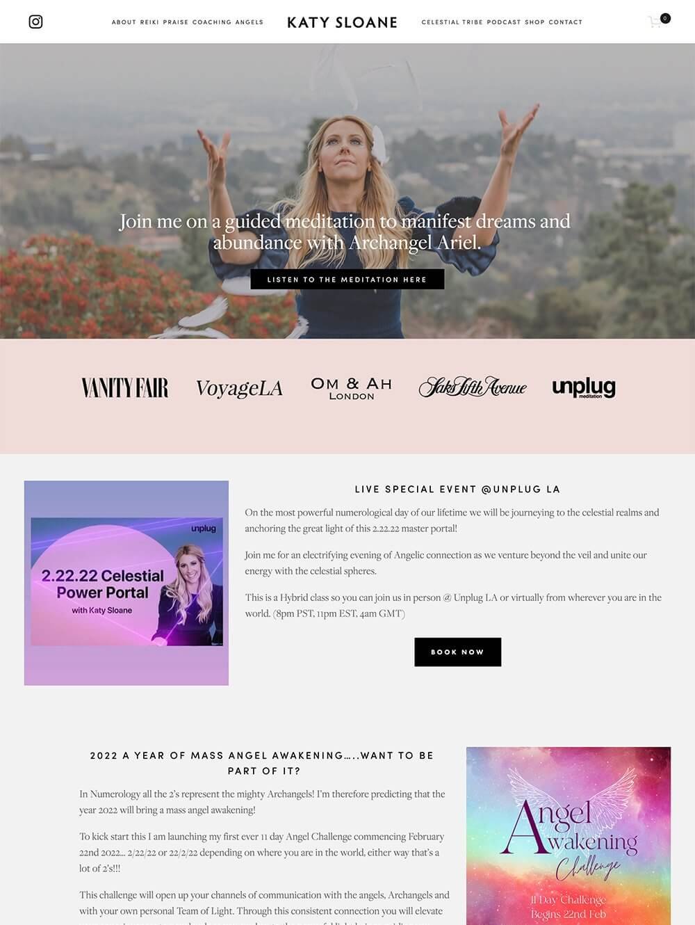
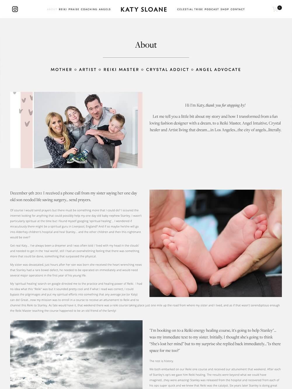
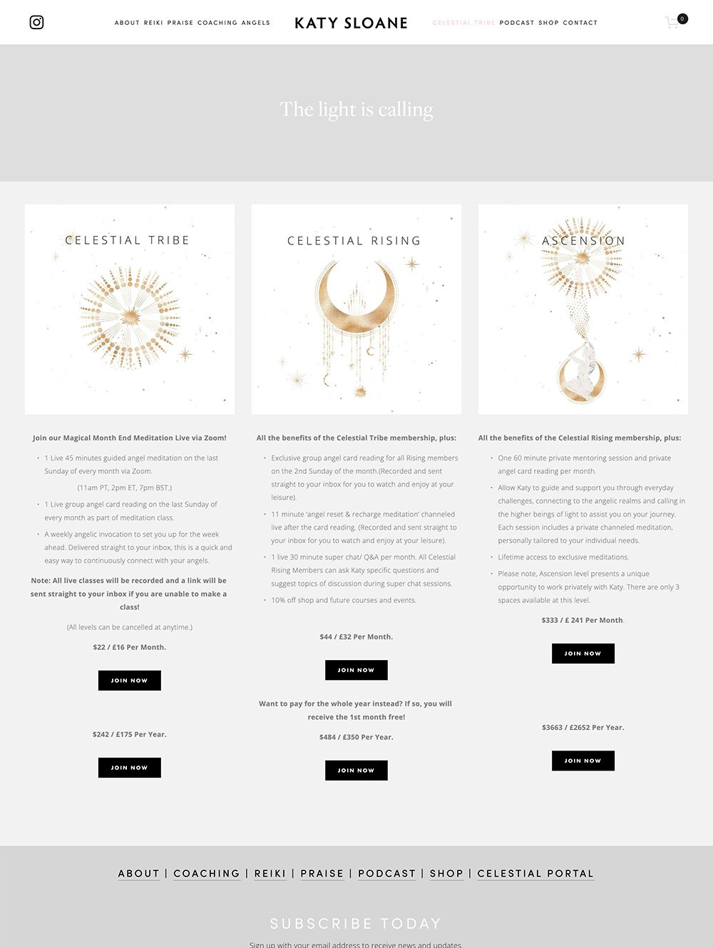
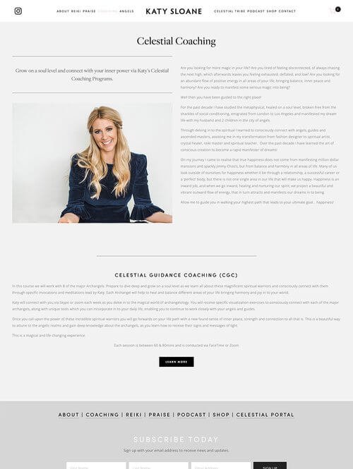
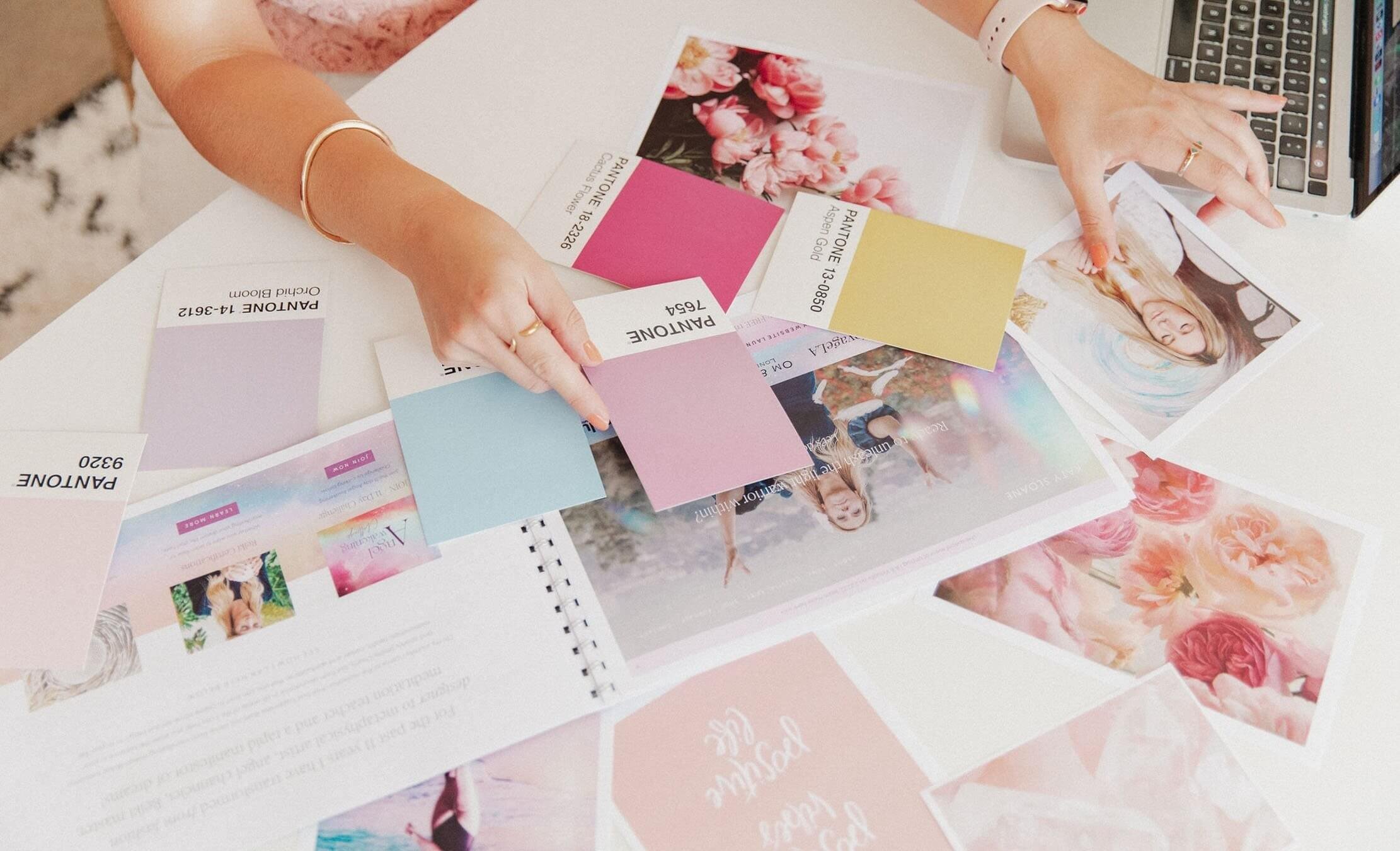
Katy wanted COLOUR!!! Katy’s website was created a few years before her new colourful rebrand and it was a lot more subtle in colour, very monochrome with a hint of blush pink and grey lilac. Over the years Katy has really found her feet in her business, her style and what she wants that to look like.
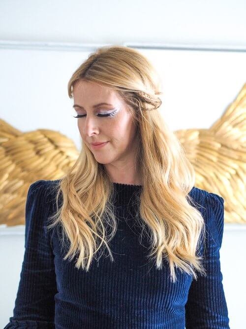
Katy wanted her new branding to feel very celestial like, like the galaxy, stars, colours, gold icons. This was one of the most fun rebrand / refreshes I’ve done and I’m super pleased with the results as was Katy (thankfully haha).


