Cindy Gardner
REBRAND | Branding, Logo & Squarespace Website Design
The Rebrand
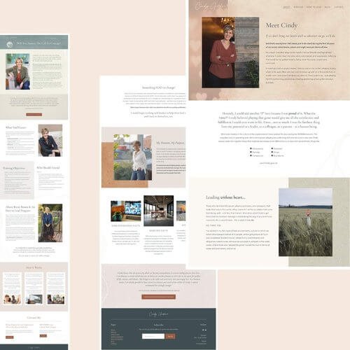
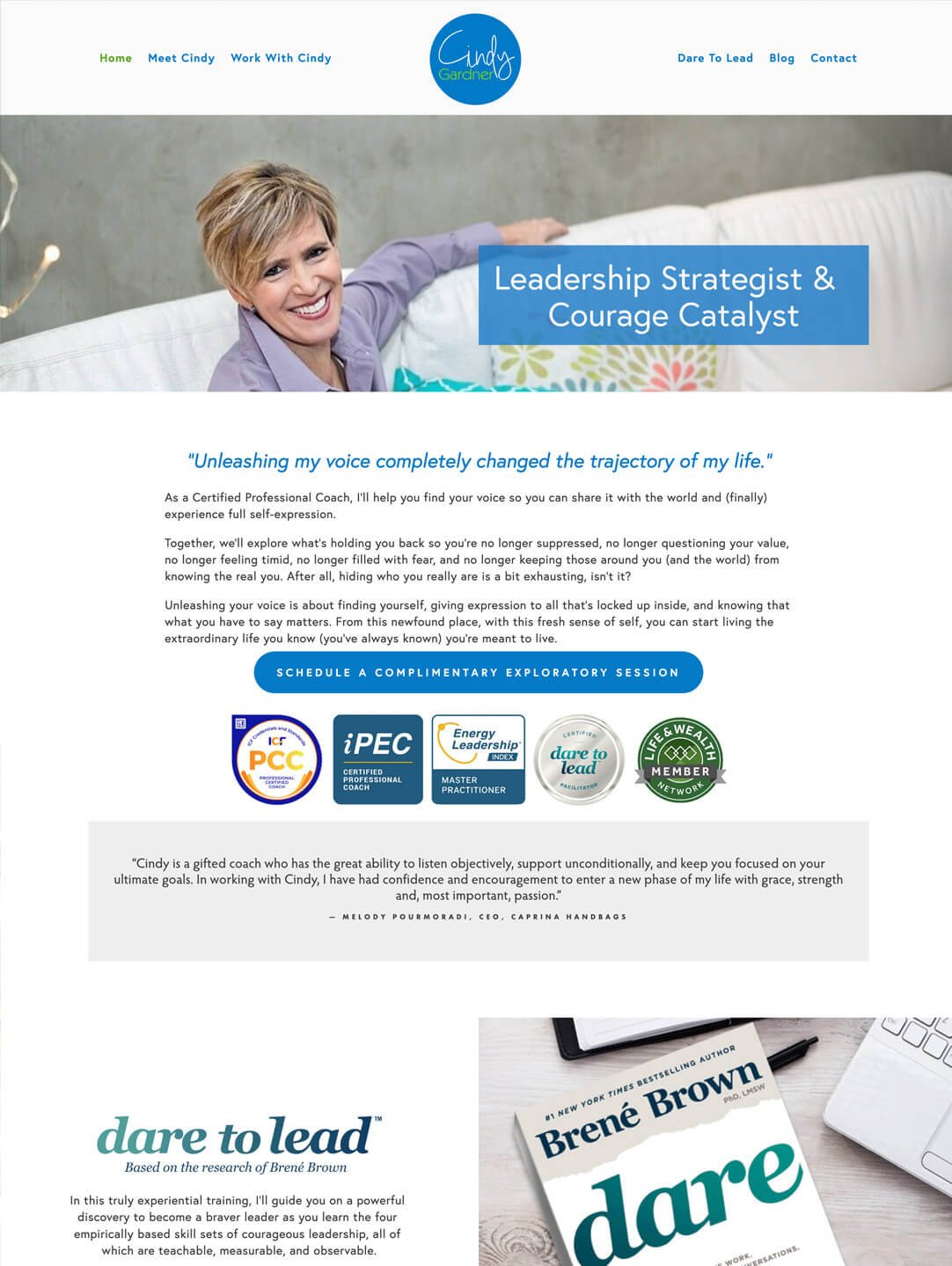
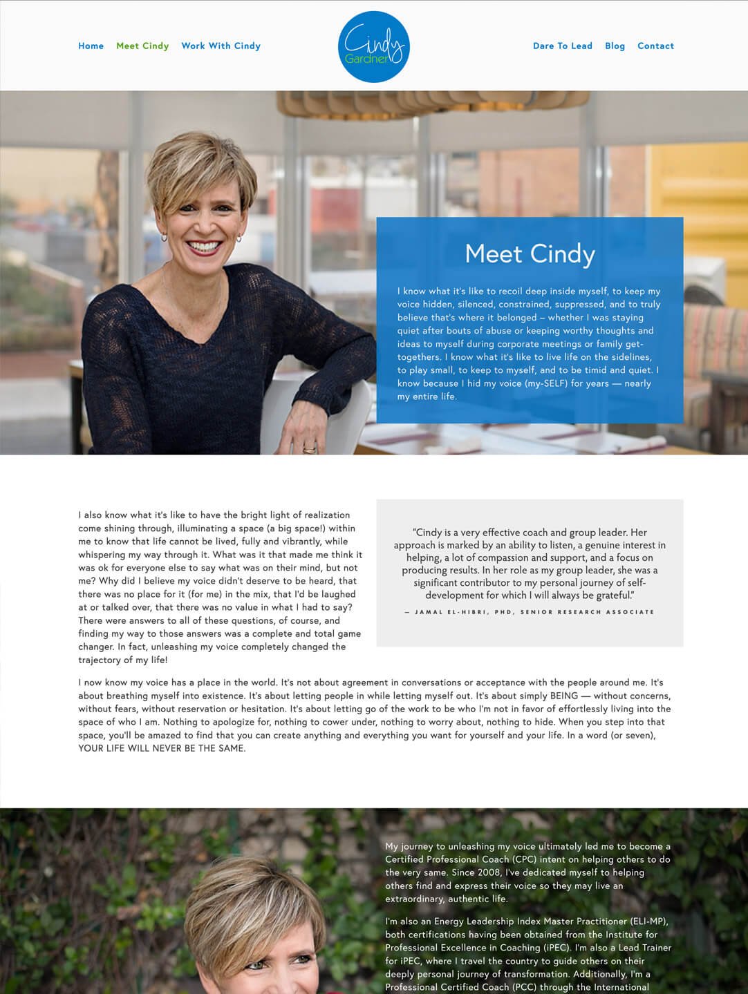
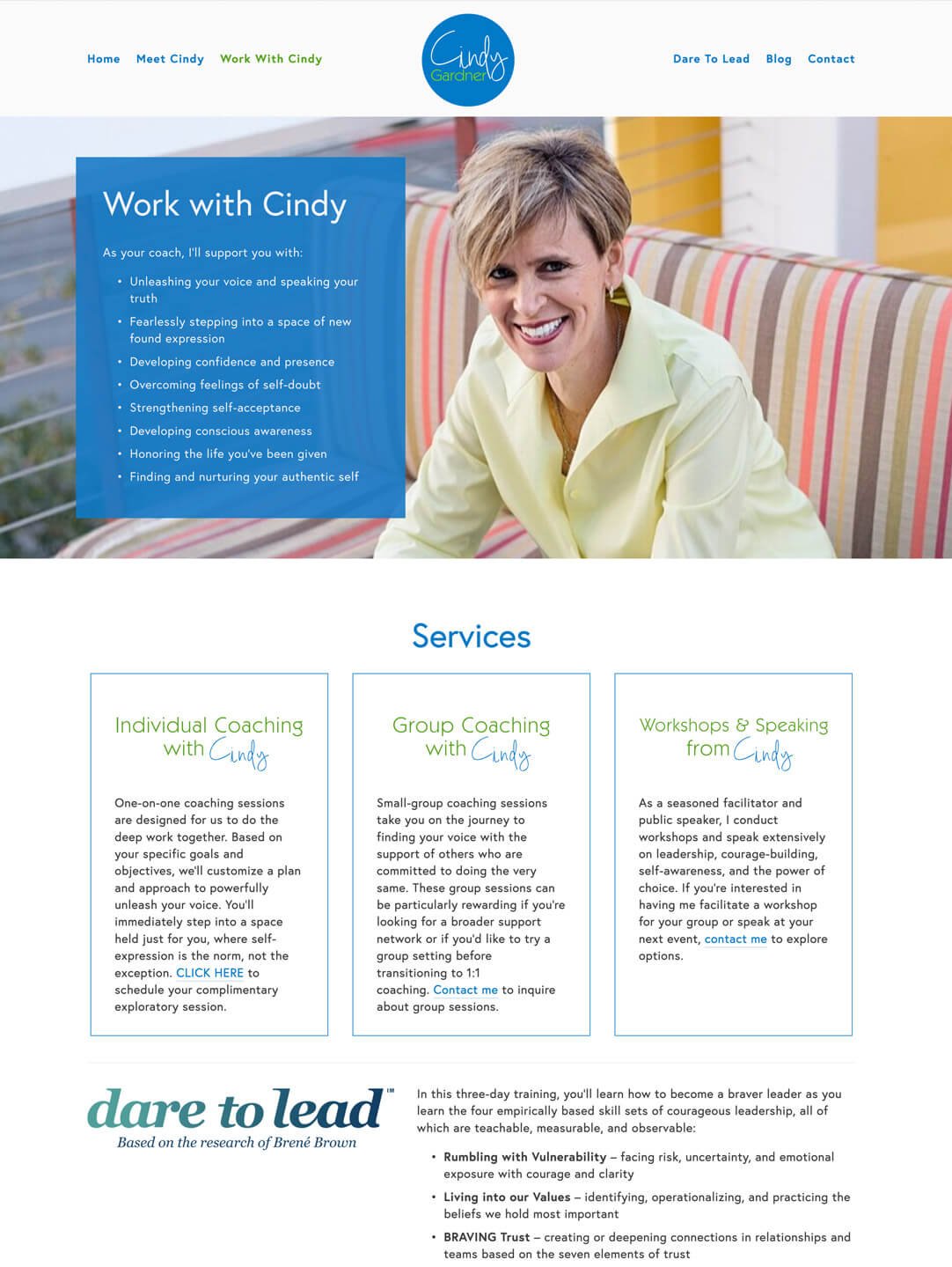
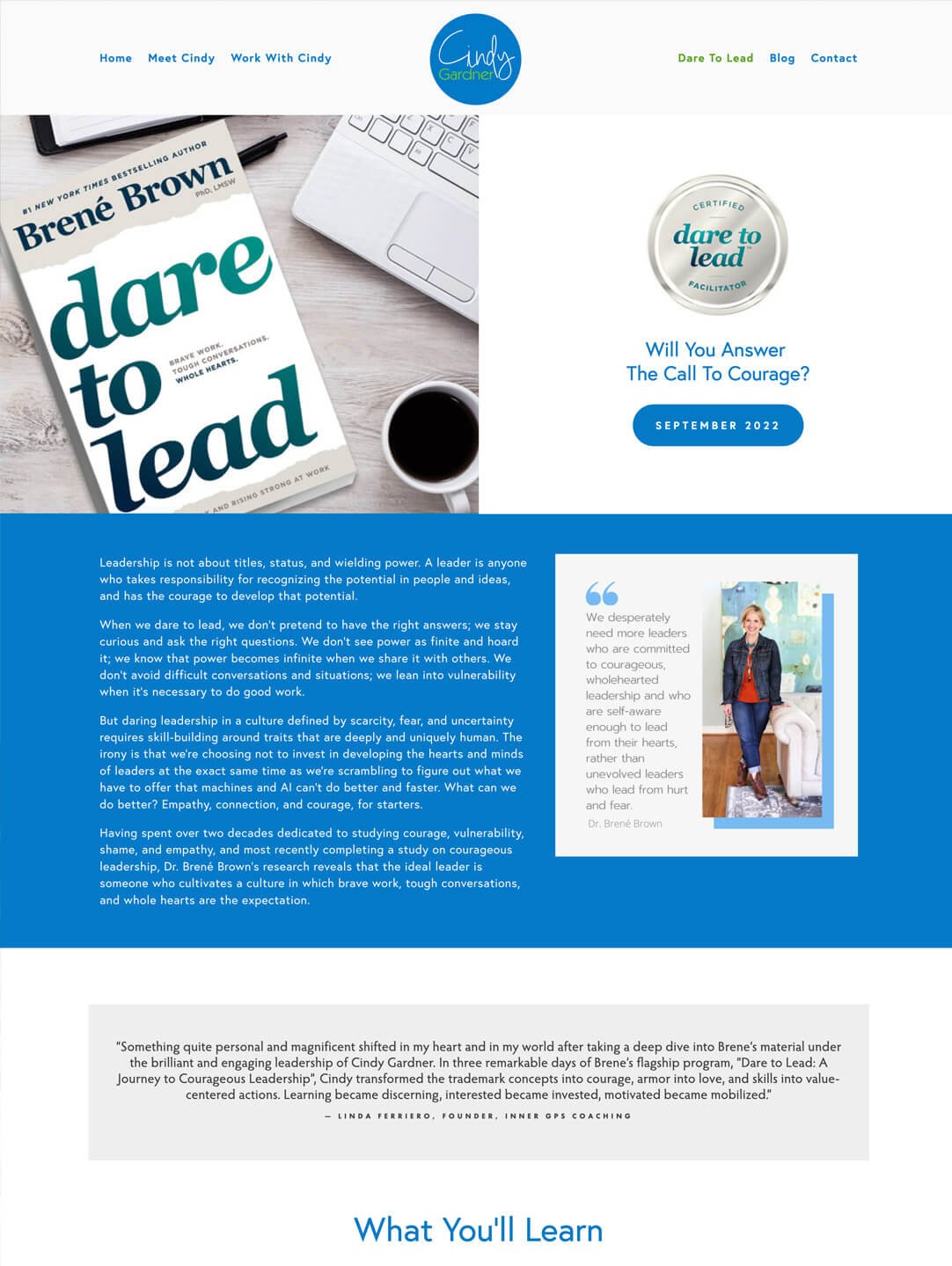
When Cindy came to me she felt that she’d really outgrown her previous branding. The blue and green tones in primaryesque colours, no longer felt like her. Cindy is all about good energy and she knew that when her brand & website aren’t reflecting the energy she wants to put out in to the world - then something needs to be done!
We went for a much softer, textured feeling brand & website for her. When you look between the two brands - before & after - I believe you can truly feel the difference. Her new branding should make you feel calm and at ease, exactly how Cindy wants you to feel when working with her.
Before
After
HEAR FROM CINDY ON OUR WORK TOGETHER
“As soon as Liz described her creative process to me, I was a bit tentative because it required a complete leap of faith on my part, to really give her the space to create, and for me to get out of the way. Having been through other creative processes, there was something distinctly different here.
Liz and I would start with a foundational (and fun!) conversation, I would collect a bunch of “artifacts” on Pinterest boards, and then Liz would go off and do what she does best: CREATE! Wait! That’s it? That’s all you need from me? I don’t get in your way to try and direct and control the creative process?!? Oh boy; this is going to be different!
Liz assured me there was nothing to worry about, that she had me, that all I needed to do was let her do her part.
I was truly bowled over when Liz did the big reveal! It was clear in her design that she truly understood the essence of me, and the “heart” of my work. Warm and vibrant, clear and colorful, Liz struck the absolute right balance of elements in her beautiful design. And it didn’t take two or three times to get the design down; it took just one - and that was perhaps the biggest surprise of all.


